
POSTER DESIGN

Given this cartoon is all about fast-food, I found it very fitting to make the poster look exactly like those TV commercials. A good poster should really tell you everything you need to know about the film without saying anything- and I think this does a good job.
The bullies of this film are symbols of the media, they are celebrities, products. They are seductive, manufactured characters to sell an idea to your psych to consume. But when you actually submit and take a bite out of it, it leaves you running straight for the toilet.
Everyone knows that fast-food isn't very good for you- some of the most pretentious people would judge you for eating a crunchwrap supreme but posses a personality with the same ingredients. This is something much worse than obesity and a spicy bum, lemme tell ya.
I designed this poster to intentionally mislead you to expect some kind of typical fast-food advertisement. It connects you to the mind of the film's protagonist who's expecting the same treatment from the commercials.
I even promise THE LeBron James is in the movie, which he clearly isn't. I am lying to draw people in, the same tactics used by companies that sell an idea regardless of how unhealthy it is.
CONCEPT ART


Cheeseballer was the first character I drew before I knew what he even was supposed to be. All I had was a premise of an anti bullying PSA trying to take place in the streets- which doesn't play by no playground rules.
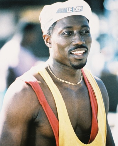

The Bart Simpson looking kid on the far-left was scrapped because he didn't provide anything except pointless exposition that Cheeseballer is famous. He comes up to him wanting an autograph, which results in Cheeseballer rubbing his cheesy hand all over his face. It was just an absurd joke that didn't really hit.
Character Sheets
 |


At the time I designed these I was looking at some Adult Swim stuff: Aqua Teen Hunger Force and Home Movies. I originally intended to animate it in a similar limited-animation style. My mentor, Jason Groh, gifted me his whole DVD collection of Ren & Stimpy which changed everything.

The episode 'Mad Dog Höek' was the best reference for a lot of Cheeseballer's expressions as the wrestlers have a similar design with expressions that express the most testosterone, steroid fuelled rage.
Trading Cards
At the end of school, Sheridan College gave students an industry day opportunity where we would screen our films and network to industry guests. This gave me the big idea to make the trading cards from my cartoon into real life business cards. This added an extra layer of depth to my cartoon's theme of advertising.
Everything from the poster, the character designs, and story is an advertisement spectacle for this event. Having the opportunity to show my film to an entire audience in a theatre was huge inspiration for all of this. I believe most of the best movie blockbusters were never successful because of the art itself, it was the stellar marketing strategies which made all these films seem grander than what it was. That was done explicitly through commercials, posters, merchandise, which all made movies into an EVENT.
This was back when companies put more effort into marketing and spent real money on producing products, commercials, and tie-in deals with other companies. The biggest example of that is fast-food, where movies often had limited time collectibles with your happy meal. I tried replicating this the best I could within the school environment alongside a limited budget. The end result is something that eased workload while enhancing my film's impact.
You could argue the fact that the content kinda overshadows the actual business card features is a bad thing, but I think it's necessary within the context of the event. The film is essentially a staple of my abilities and should be placed first, and myself second. Industry guests likely accumulate hundreds of business cards that end up discarded, if it's more of a collectible product than a business card they'll be more likely to keep around.
 |
| Physical Trading Cards |
 |
| Card Front |
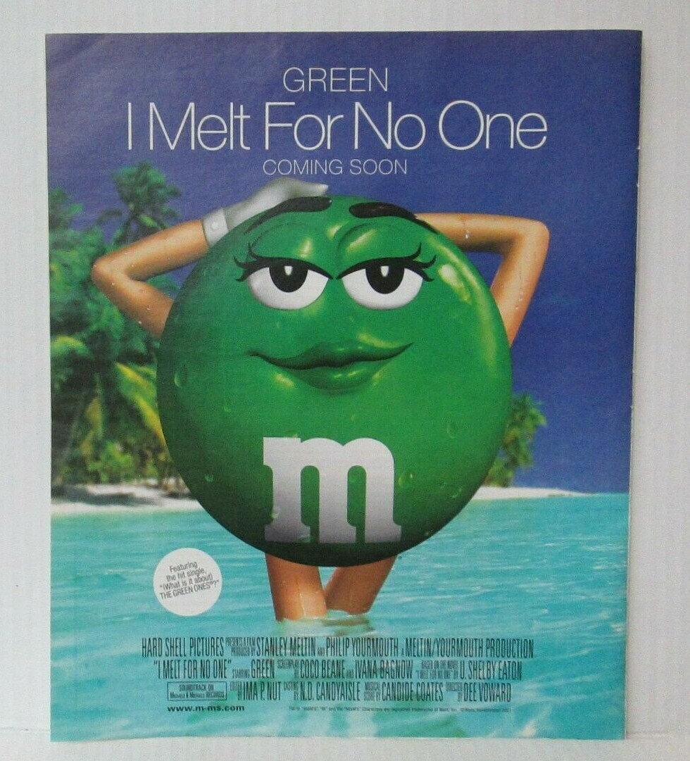
Taco Belch is an obvious spoof of Taco Bell, it was suggested by my mentor to avoid copyright infringement. I was originally going to make it literal Taco Bell because I find blatant product placement hilarious- inspired by Demolition Man.
Product placement jokes probably only works better as a quick one-off joke instead of revolving around the entire story. People probably wouldn't understand it and think I was actually sponsored by them- which might have actually been pretty funny. Either way, I wanted to stay moderately safe on this project as it was technically made for school and industry guests, as well as being something I considered applying to film festivals.
 |
| Crunchy Slam-Diva |
I don't think cartoonists who designed all these sexy cartoon characters considered the ramifications it had on the minds of developing kids. Most naturally grew out of it, but unfortunately due to the internet- love for cartoon chicks grew obsessively. I find it kinda weird and freaky, so this character was meant to comically express that. It's okay to enjoy attractive cartoons, but it's best to acknowledge that the characters aren't real. Especially if they're an anthropomorphic crunchwrap or chocolate snack.


Background/Layout Designs


She added some funny details like: ashy skin, cheesy lips, booger nose, open fly, untied shoes, ugly shirt. What more could I ask for?


No comments:
Post a Comment